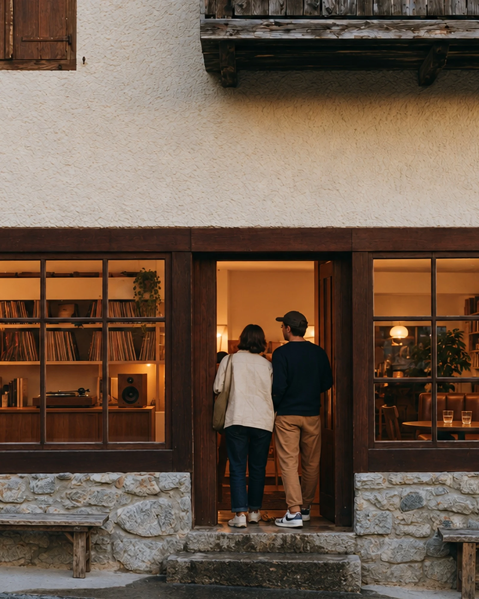


Lake. Sun. Lunch.
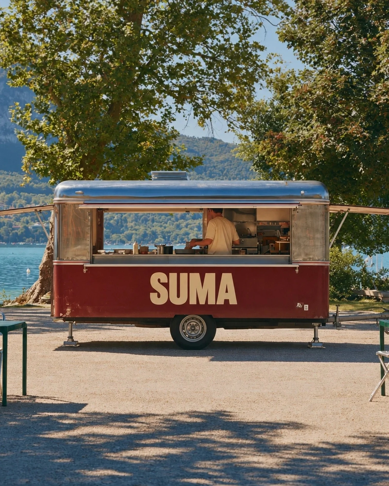
A caravan by the water, pitas and bowls to take away. SUMA stands out through tomato red, condensed lettering and a small sun above a bowl.

Keep the brand legible on a caravan and on crumpled wrapping paper. Make a menu people can understand before joining the queue.
A nameon the move.
 01 / The bowl
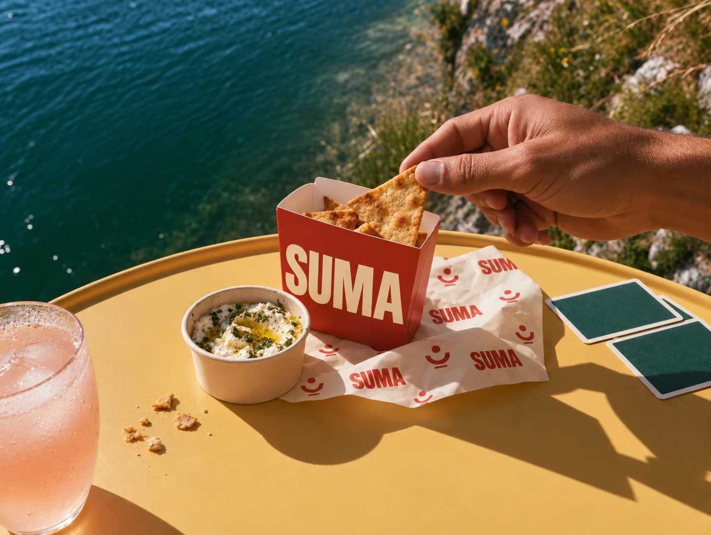 02 / The snacks
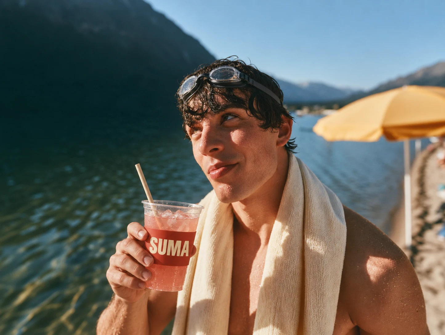 03 / The drink
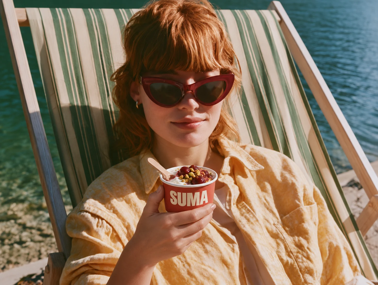 04 / The dessert
From patternto pita.
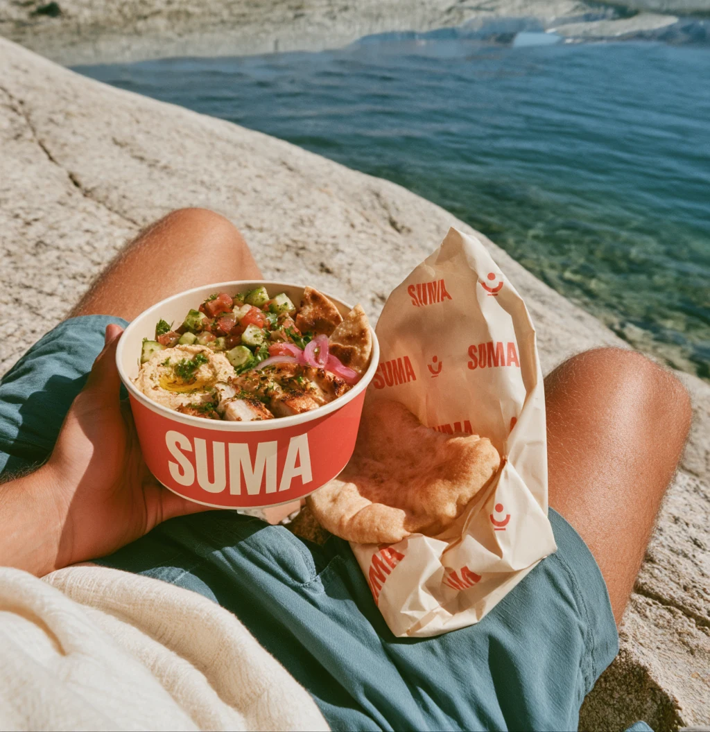
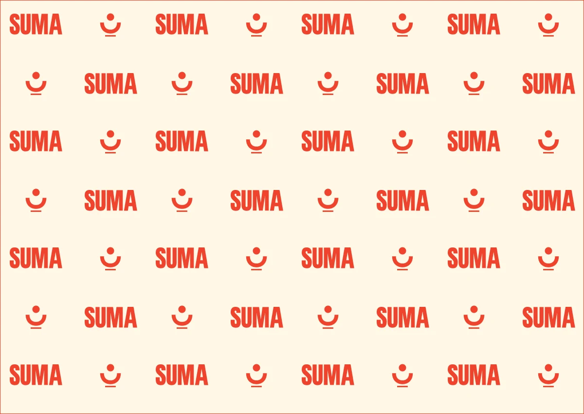
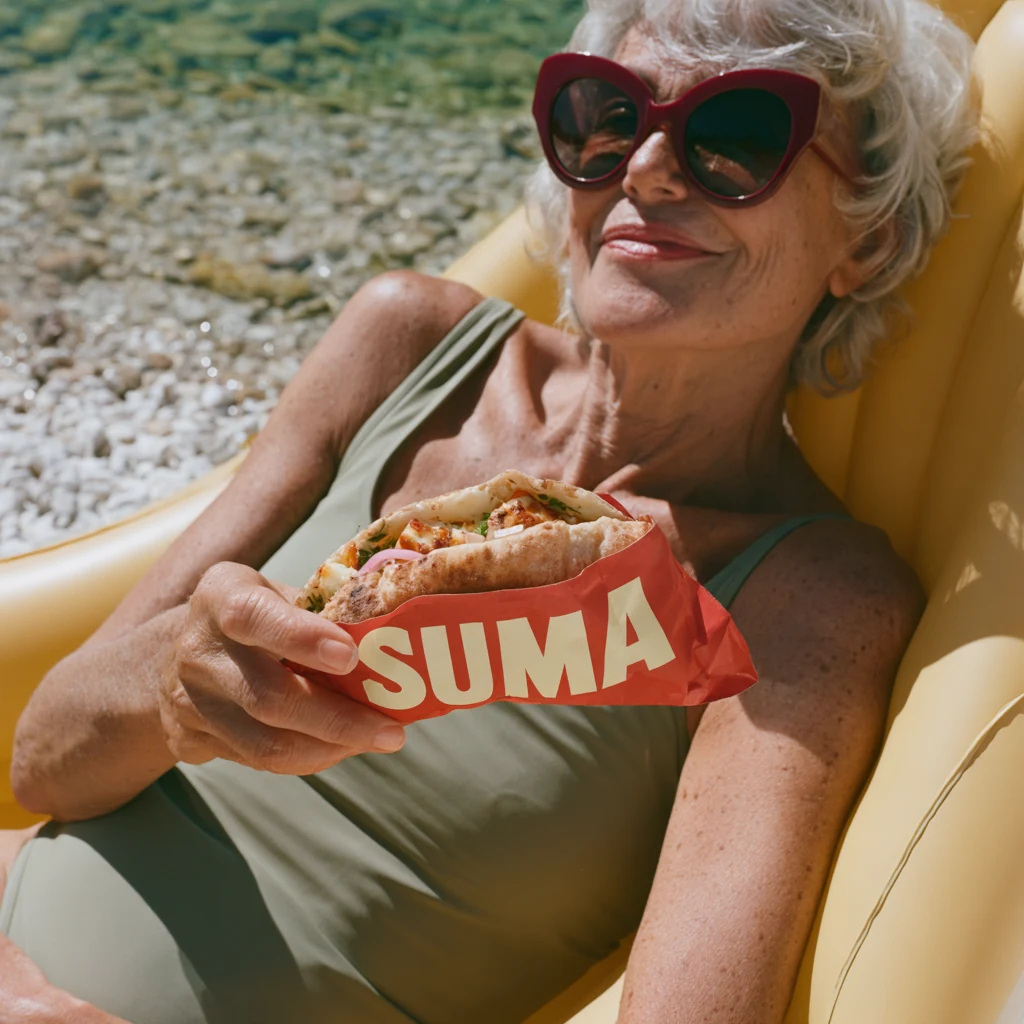
The wrapping paper repeats the name in every direction. Even folded around a pita, a patch of red and a few letters remain visible.
From noonto sunset.
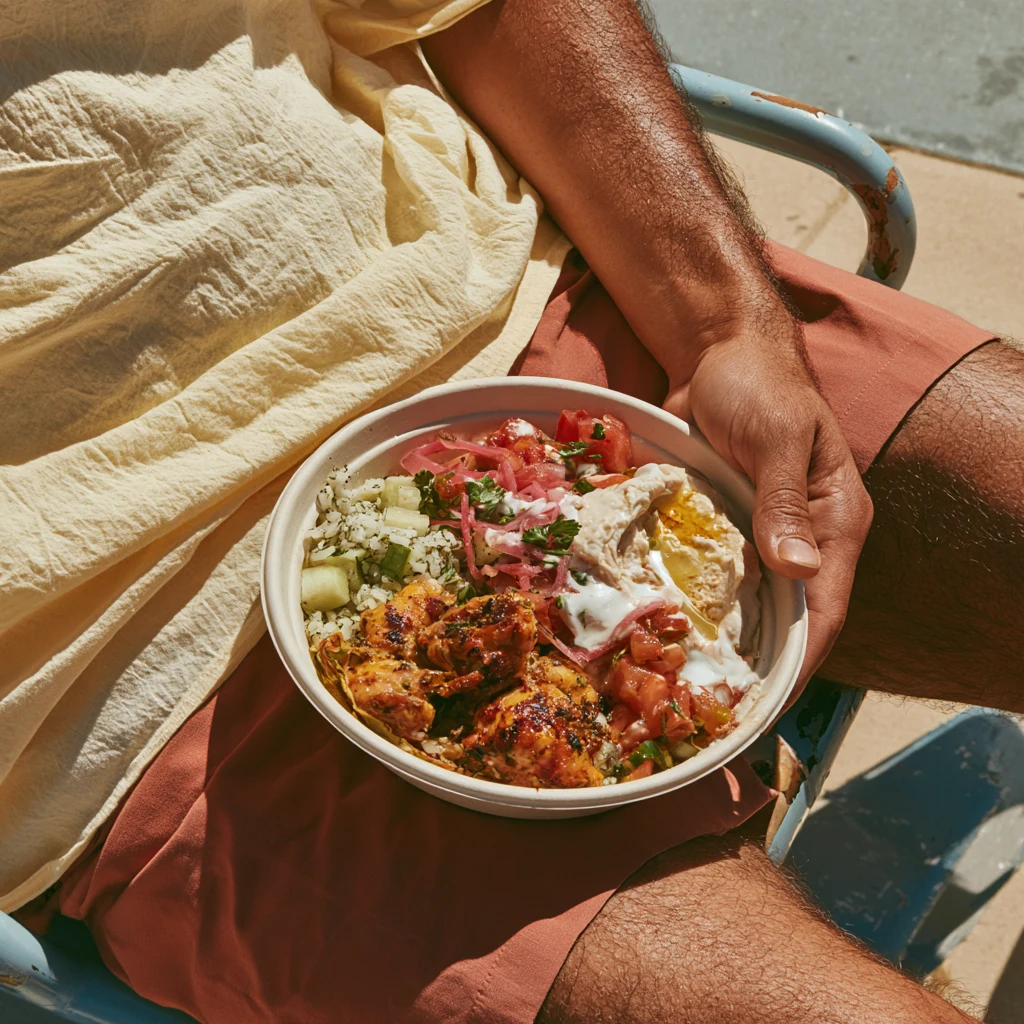
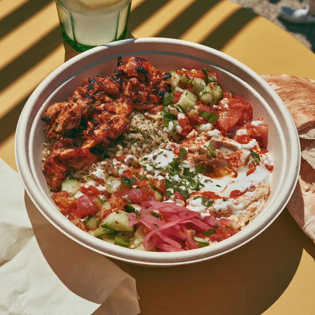
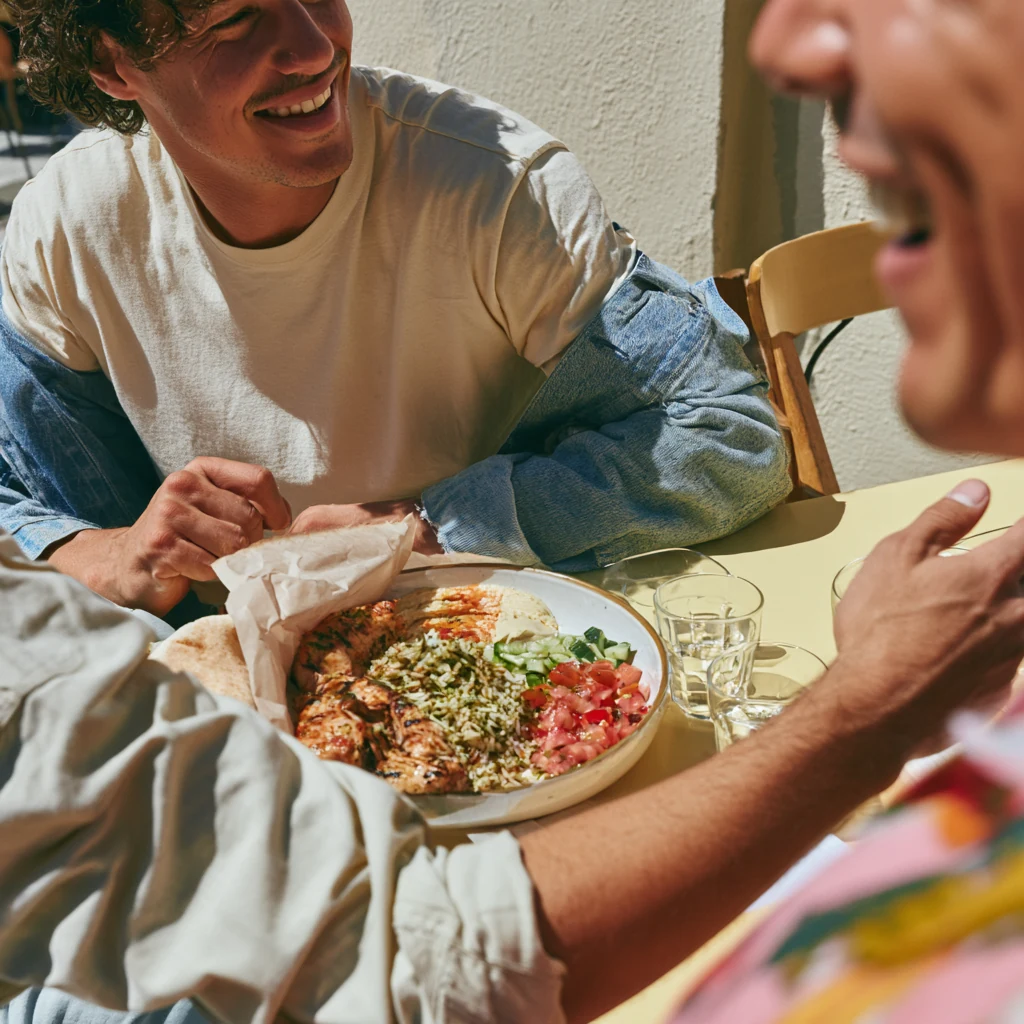
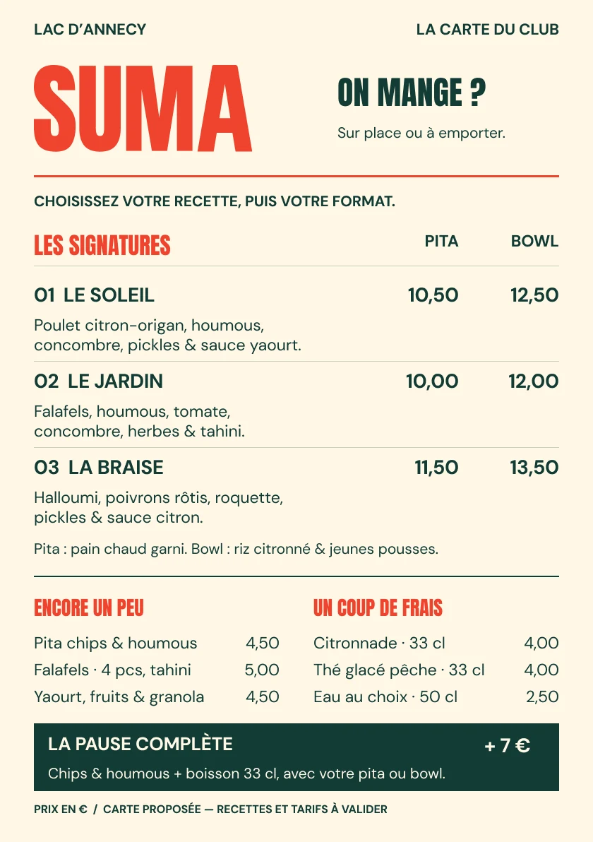
A compact name and a repeating pattern run across the packaging. The menu presents three recipes in two formats. Tomato red and lake green carry through to photographs of lunch outdoors.
Sunshine.On a plate.
The menuand the paper.
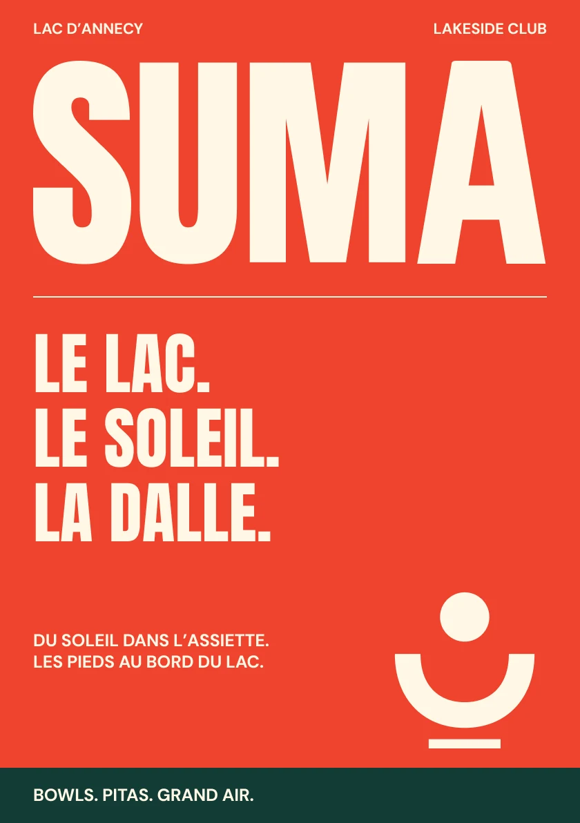
Three signatures, two formats and something to snack on. The menu works both ways: dishes on the front, a poster on the back.
- Identity
- Menu
- Packaging
- Image direction
- Motion
Studio project — identity and art direction by Repas.