

Ten products. One Alpine pantry.
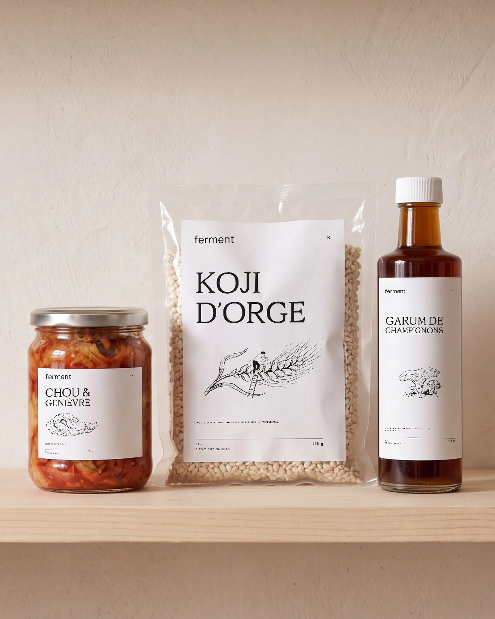
Pea miso, barley koji, mushroom garum: ten products in an Alpine-inspired pantry. White labels combine drawn lettering, clear information and a character hidden inside each ingredient.
Explain unfamiliar products without turning their labels into manuals. Show how to use them, starting with the first dish.
Ten waysto change the flavour.
 01 / Pea miso
 02 / Barley koji
 03 / Mushroom garum
 04 / Cabbage & juniper
 05 / Apple & chilli
 06 / Apple vinegar
 07 / Rye miso
 08 / Wild garlic
 09 / Beetroot & caraway
 10 / Pear & spruce
Garum,up close.
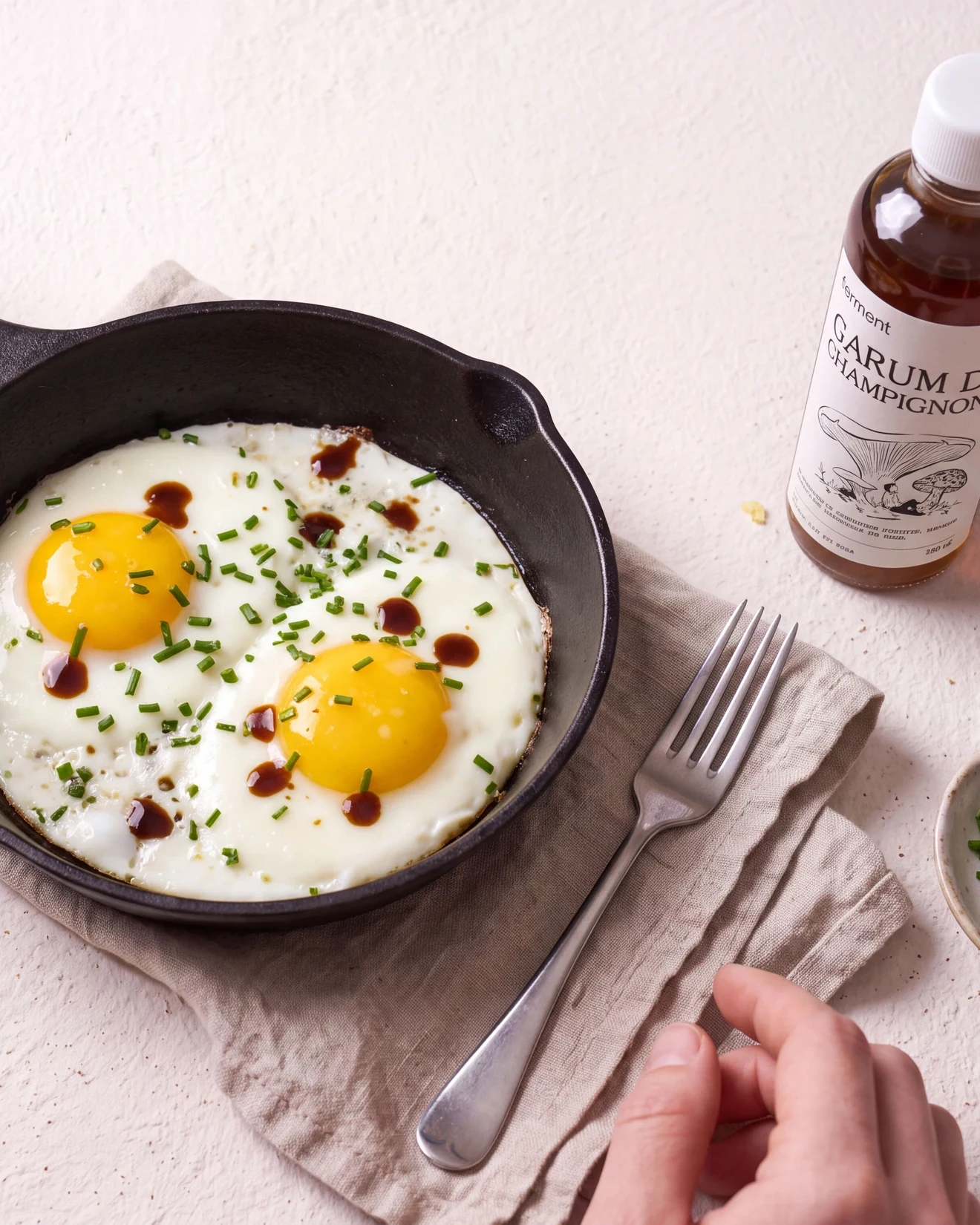
The drawing gives the mushroom a character: a figure resting under its cap. A recipe brings the product into the kitchen. Three images connect the label to the way it is used.


From the pantryto the kitchen.
A page to explain each product, photographed ingredients and step-by-step recipes. On mobile, the instructions stay easy to follow while cooking.
One gesture,three flavours.
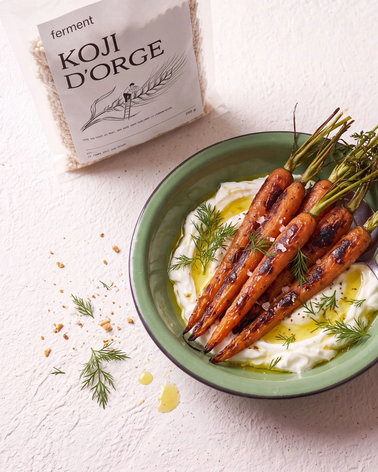
Each product carries an ink drawing and a clearly visible name. Ingredient details use monospace type. On the website, packshots sit alongside recipes and their steps: first the product, then what to do with it.
Time doesits work.
Beyondthe jar.
The drawing moves off the label and into shopping bags, notebooks and everyday kitchen routines.

- Brand concept
- Identity & illustration
- Packaging
- Image direction
- E-commerce website
Studio project — identity and art direction by Repas. Demonstration shop; no products are sold.