

← ALL PROJECTS(04) / 06 — BRAND CONCEPT / 2026
WINE BARSAME AGAIN?
Same again?
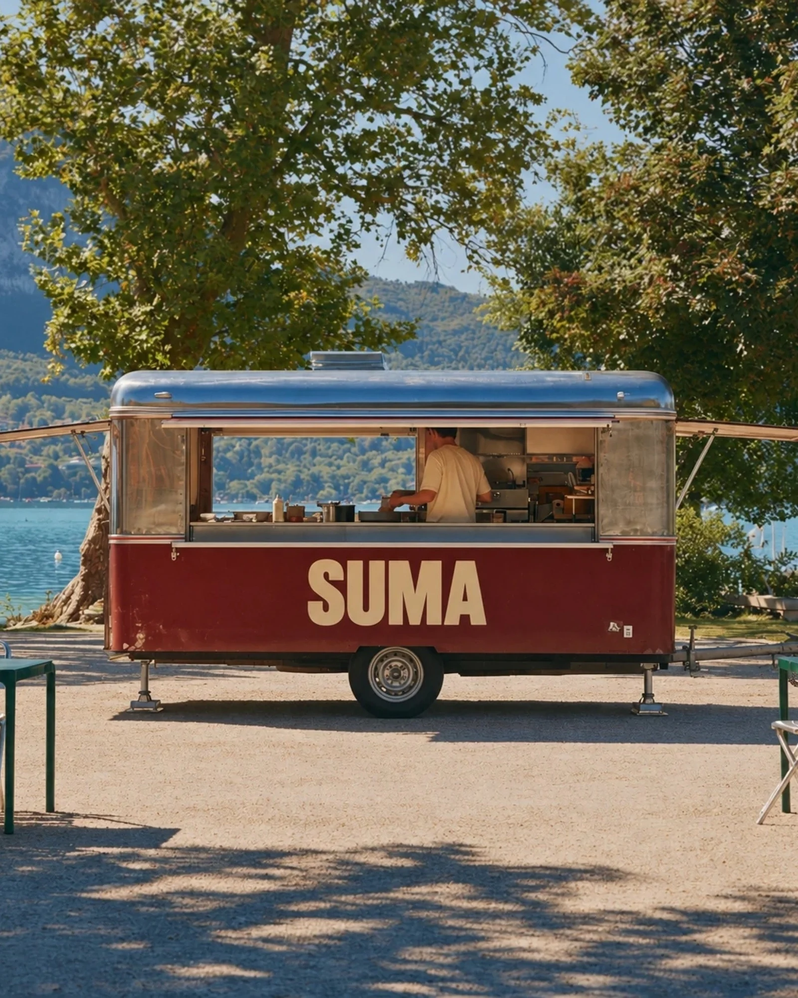
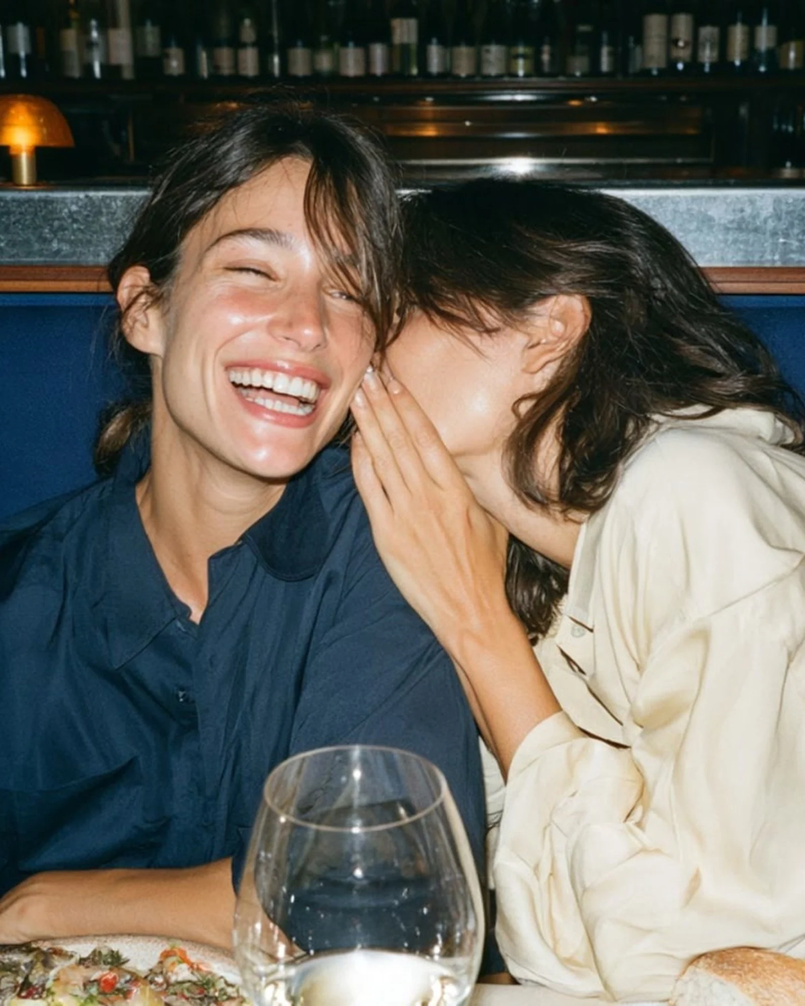
Three letters, a generous blue and a reason to stay at the counter. RAB's wine-bar identity is built around long evenings and plates passed around.
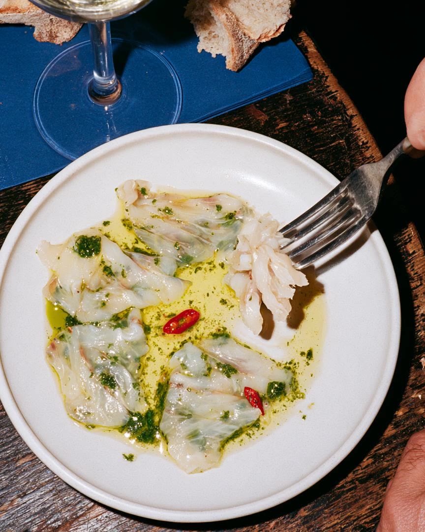
Capture a bar's character in a short name, without falling back on familiar wine-cellar imagery.
03 / In detail
Wordsfrom the bar.
“We saved you a seat.” “A bar.” The writing sounds like conversation. Words shift in size and position, using the same blue and cream as the name.
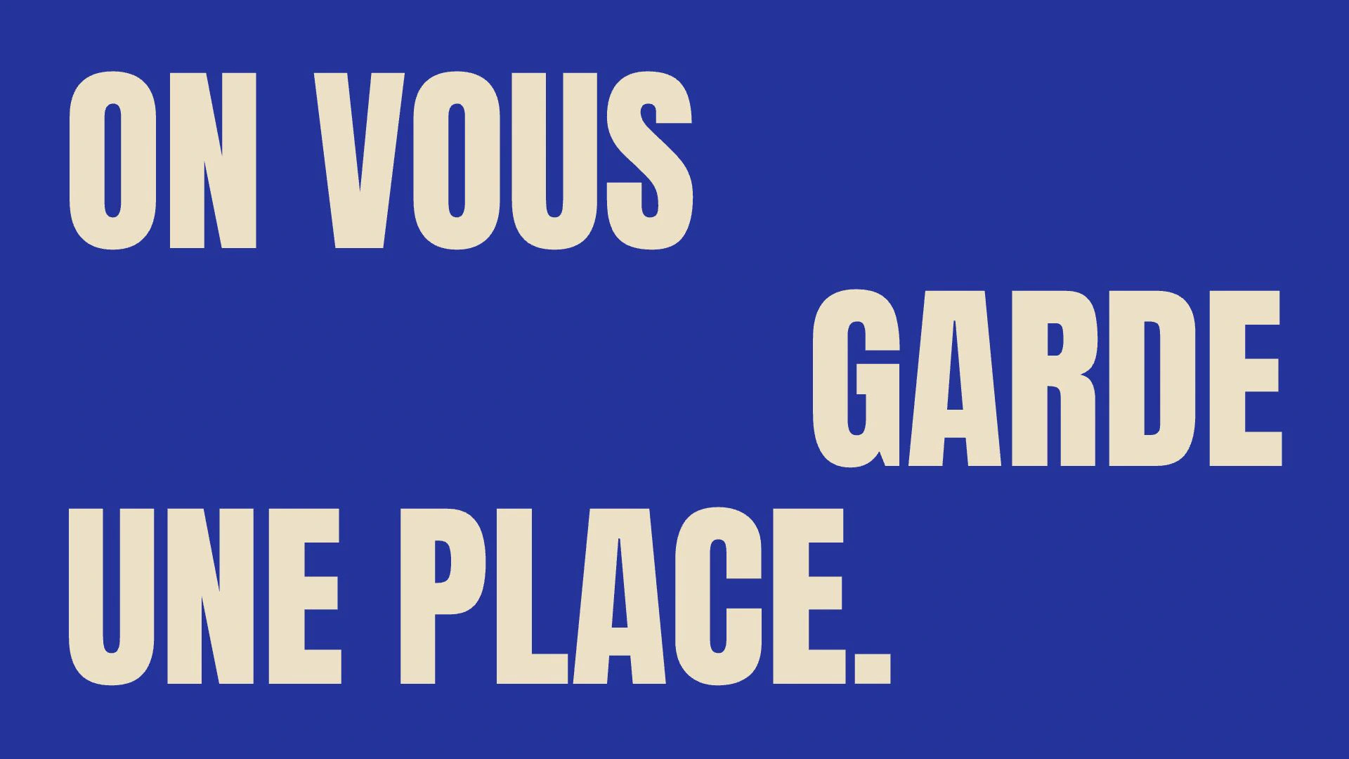
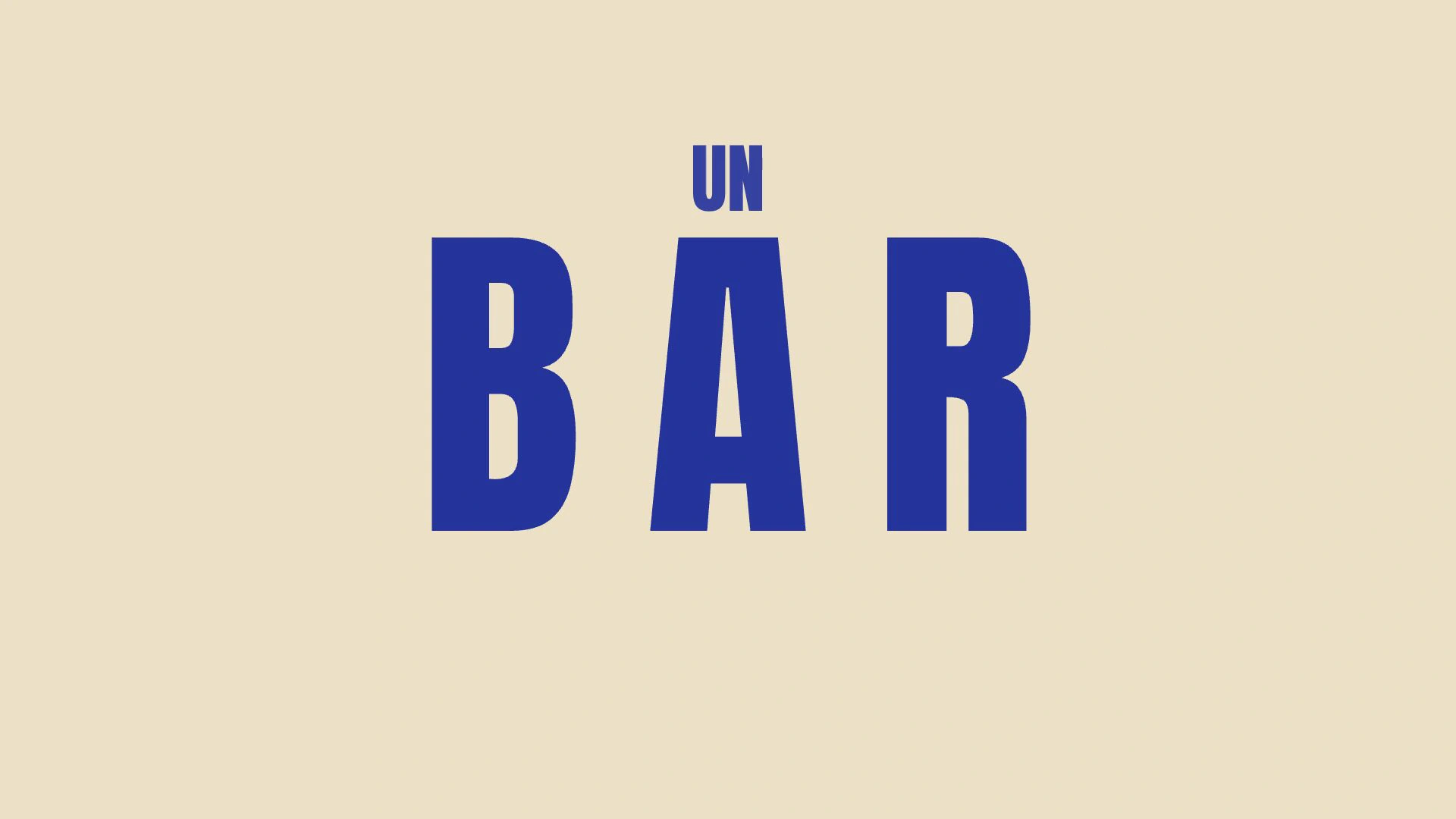
Cream capitals fill the blue with confidence. The sentences are short and the camera sits at counter height. In the film, words set the pace for glasses and conversations.
05 / The system
Good wine. Good company.Another round.
- Identity
- Imagery
- Motion
Studio project — identity and art direction by Repas.